Visual Identity Design in 2026: A Field Guide From Live Accounts
A visual identity is not a logo with some colours attached. It is a system that makes every ad, post and page instantly recognisable as yours. Here is how we design identities that perform in the feed as well as on paper.
Key takeaways
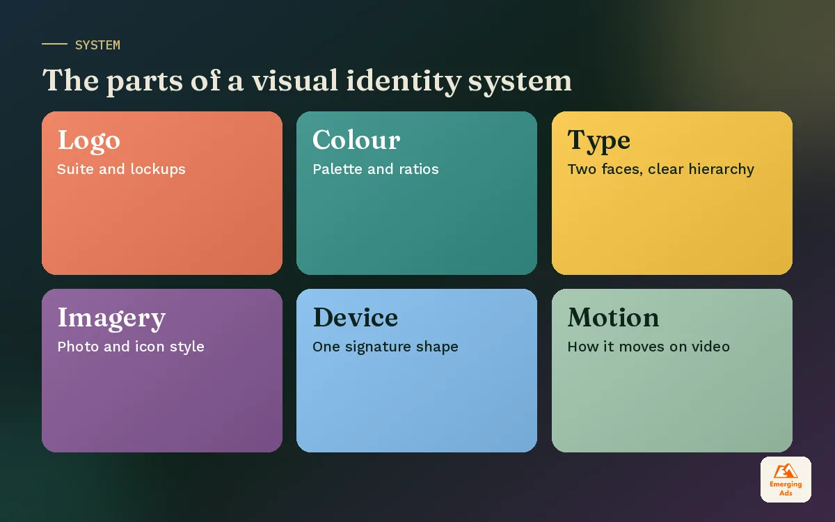
- A visual identity system covers logo, colour, typography, imagery, graphic devices and layout rules, working together.
- Design for digital first: phone screens, feeds, ad placements and dark mode, then adapt for print.
- One or two signature devices, used everywhere, build recognition faster than a long list of rules.
- Test identity routes in real contexts, including live ad mockups, before signing off.
- Deliver templates and a usable guide with the identity, or it will drift within months.
01What visual identity design covers
Visual identity design is the process of creating the full set of visual elements that express your brand and the rules for using them. It includes your logo, but the logo is only one piece. The system is what makes a brand recognisable even when the logo is not visible, such as in a cropped social post or the first second of a video ad.
Think about the brands you recognise instantly in your feed. You usually spot them from a colour, a type style or a photography mood before you read a name. That is visual identity doing its job.
| Element | What it includes | Why it matters |
|---|---|---|
| Logo suite | Primary logo, symbol, wordmark, lockups | Anchors recognition and ownership |
| Colour palette | Primary, secondary, neutrals, usage ratios | The fastest recognition cue in a busy feed |
| Typography | Headline and body typefaces, hierarchy | Sets tone and keeps content readable |
| Imagery | Photography style, illustration, icons | Carries mood and shows the product world |
| Graphic devices | Shapes, patterns, frames, textures | Signature elements that make layouts ownable |
| Layout rules | Grids, spacing, composition | Keeps every format consistent |
| Motion | Transitions, logo animation, text behaviour | Essential for video and social |
02Why visual identity matters for performance marketing
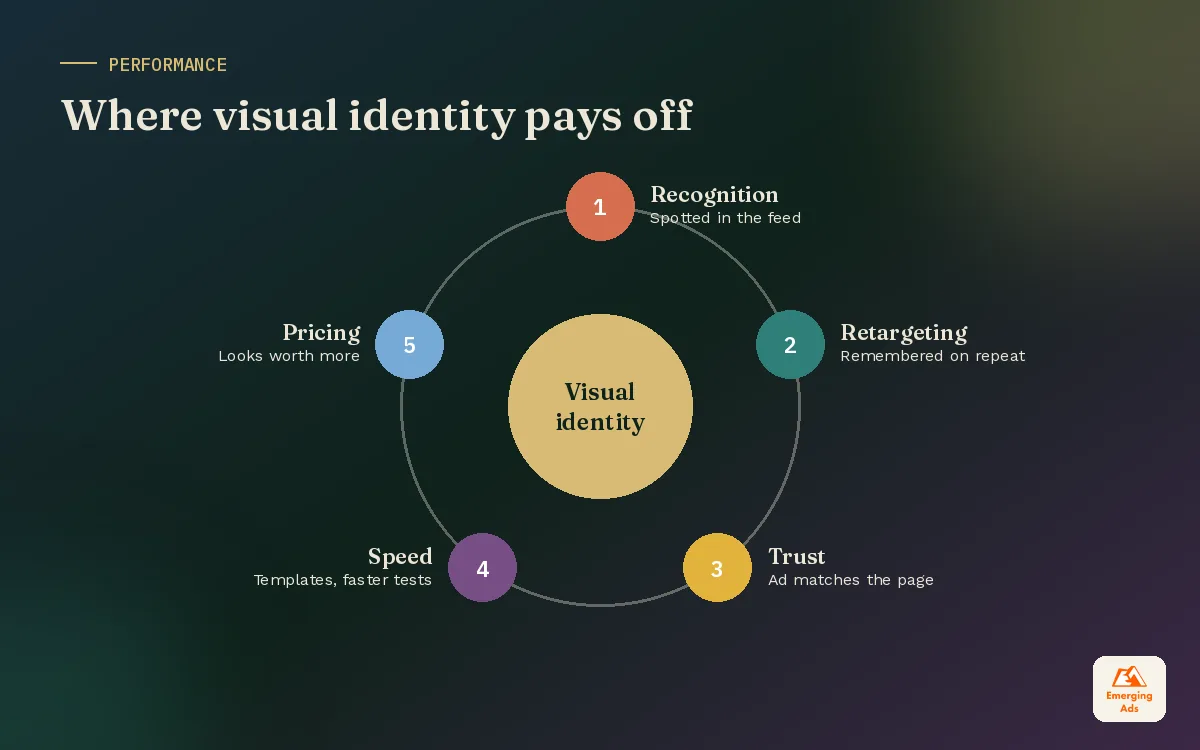
In paid media, you often have less than a second to be noticed and remembered. A consistent visual identity helps in three practical ways.
- Faster recognition. Repeated colours and devices help people recognise your ads on second and third exposure, which makes retargeting work harder.
- Trust at the click. When the landing page looks like the ad, people feel they are in the right place. Mismatched visuals increase bounces. We check this first in every landing page design project.
- Faster creative production. A clear system with templates lets your team produce and test many ad variations quickly without losing consistency across Meta ads and TikTok ads.
A strong identity also supports premium pricing. Brands that look considered are easier to trust with higher prices, especially online where buyers cannot touch the product.
03Start with strategy, not with a mood board
The most common reason identity projects go wrong is starting with visuals instead of decisions. A mood board full of beautiful references is not a brief. It is a list of other people’s identities.
Before any design begins, you should know your audience, your positioning and your personality. Those come from your brand strategy and brand positioning work. The identity then becomes a visual translation of those decisions. A premium specialist should not look like a budget generalist, and a playful challenger should not look like a bank.
04Building each part of the system
Colour
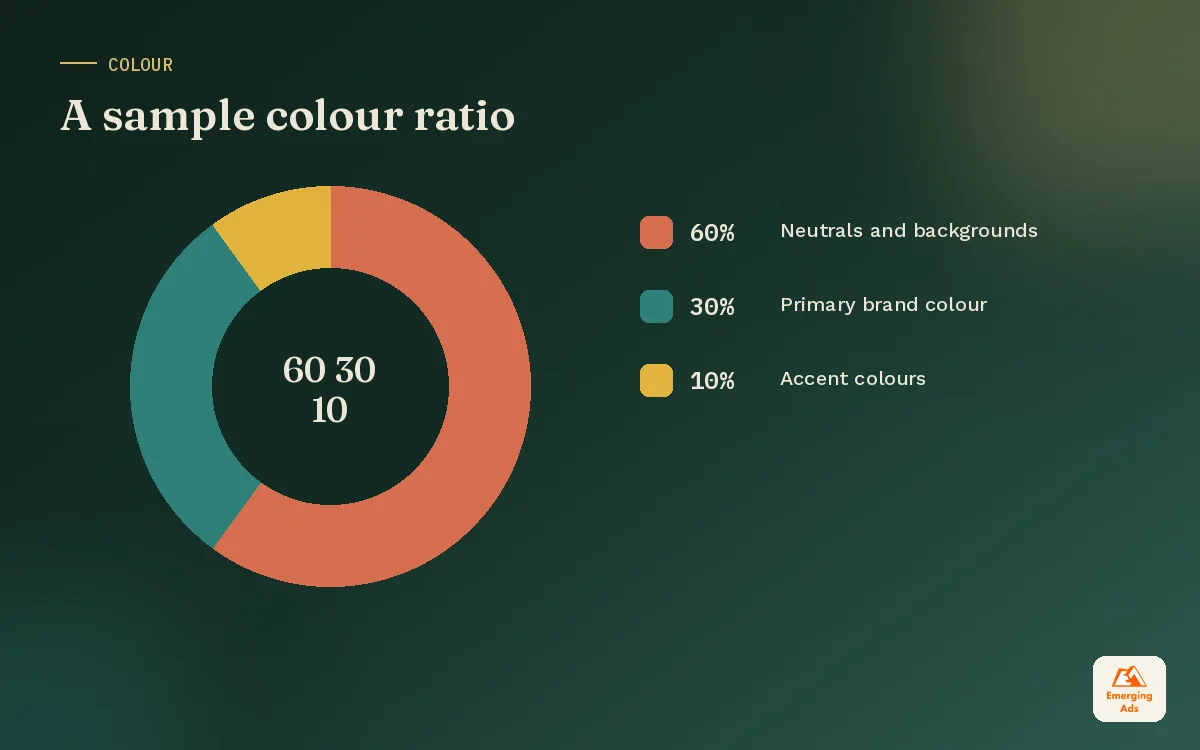
Choose one primary colour you can own in your category, supported by one or two secondary colours and a set of neutrals. Define ratios, for example mostly neutral with the primary used as a strong accent. Check contrast for accessibility, and test how colours look on phone screens in both light and dark mode. A palette that looks rich on a designer’s monitor can turn muddy on a cheap phone.
Typography
Most brands need two typefaces at most: one with character for headlines and one highly readable for body text. Check licensing for web, apps and ads. Define a clear hierarchy of sizes and weights so every layout feels related.
Imagery
Define the photography style in practical terms: lighting, colour grading, subjects, framing and how people appear. Show strong and weak examples. If you use illustration or icons, set the line weight, fill style and level of detail.
Graphic devices
This is where many identities become memorable. A distinctive shape, frame, pattern or colour block that appears across every format gives you a signature. The best devices are simple enough to work in a tiny ad and flexible enough to work on a large banner.
Motion
Video now carries a large share of brand impressions. Define how the logo animates, how text appears on screen, the pace of transitions and caption styling. This keeps video content consistent across editors and platforms.
05Our visual identity design process
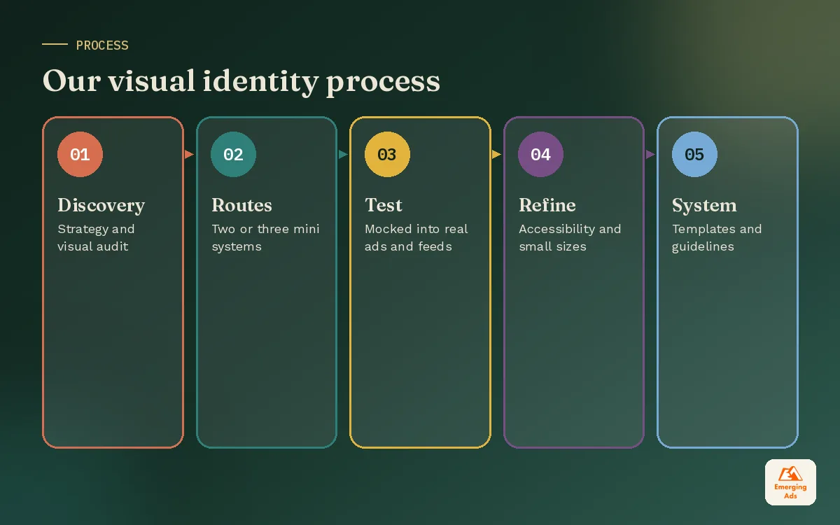
| Stage | What happens | Typical length |
|---|---|---|
| Discovery | Strategy review, audience, competitor visual audit, real placement list | 1 week |
| Exploration | Two or three distinct routes built as mini systems, not single logos | 1 to 2 weeks |
| Real-world testing | Routes mocked into ads, social, website and packaging, quick audience checks | 1 week |
| Refinement | Chosen route developed fully, accessibility and small size checks | 1 to 2 weeks |
| Systemisation | Templates, guidelines, asset library, handover session | 1 to 2 weeks |
The testing stage is the one we insist on. Seeing a route inside a live-looking Instagram feed or next to competitor ads tells you far more than seeing it on a white presentation slide.
06Designing for digital first
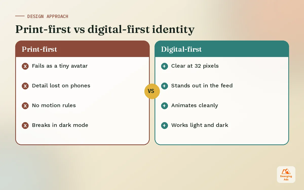
Most visual identity guides were built for print and stretched to fit digital later. We flip that. Your identity will spend most of its life on screens, so design for those first.
- Small sizes: the symbol must work as a 32 pixel favicon and a tiny social avatar.
- Busy feeds: the palette and devices must stand out against a scroll of other content.
- Ad safe zones: layouts must leave room for platform buttons, captions and usernames.
- Dark mode: every colour combination must work on dark backgrounds.
- Motion: identity elements must animate cleanly for Reels, Stories and YouTube.
- Page speed: web implementations should use efficient fonts and compressed images so the website stays fast.
07Templates and tools that keep the identity alive
An identity is only as consistent as the tools people use every day. We hand over identities with templates already built, so the team starts from something correct rather than a blank canvas.
- Social post, carousel and story templates in a Canva brand kit for non-designers
- Ad templates for the main placements with safe zones marked
- Website components documented in a Figma design system
- Email modules for your email marketing platform
- Presentation and document templates for sales and operations
The full rulebook sits in your brand guidelines, but templates do most of the practical work.
08How to refresh a visual identity without losing recognition
Not every brand needs a new identity. Many need a refresh: the same recognisable core, updated to work better on screens and in ads. A refresh is lower risk and usually faster.
- Audit what people already recognise. Colour, logo shape and one or two devices usually carry most of your recognition. Keep those.
- Fix what breaks in digital. Small-size legibility, contrast, dark mode and motion are the most common gaps.
- Tighten the palette. Drop colours that rarely get used and strengthen the ones that do.
- Modernise typography carefully. A cleaner body font can improve readability without changing the brand feel.
- Roll it out in one go. Mixing old and new assets for months makes the brand look confused.
A refresh done this way keeps the memory you have built while making every ad and page work harder. If you are unsure whether you need a refresh or a full rebrand, our main site explains when a rebrand is worth it.
09What visual identity design costs
Costs depend on the number of routes explored, how much testing is done, the size of the template library and whether packaging, signage or motion are included. Rather than quote a figure that will not match your market, use this to judge proposals.
- Logo only: the smallest scope. Useful for very early businesses, but it leaves gaps that get filled inconsistently.
- Core identity: logo suite, colour, type, imagery direction and a concise guide. The right starting point for most growing brands.
- Identity system: everything above plus templates, motion, a design system and rollout support. Best when you produce a lot of content or run heavy paid media.
Ask every provider exactly what files, templates and rights you will receive, and whether real-world testing is included.
10Visual identity examples by category
These patterns are illustrative, showing how identity choices follow strategy.
| Category and position | Visual direction that fits |
|---|---|
| Premium skincare for sensitive skin | Soft neutral palette with one calm accent, generous white space, close-up texture photography |
| Challenger fintech for freelancers | Bold primary colour, confident sans serif, simple illustrations of everyday work |
| Specialist law firm | Deep colour with restrained accent, classic serif headlines, real team photography |
| Beginner strength gym | Warm energetic colours, friendly rounded type, real members rather than models |
| Farm-to-table restaurant | Earthy palette, textured backgrounds, natural light food photography |
In each case, a customer should be able to guess the category and the attitude from the visuals alone. If you work in hospitality, our food and hospitality team uses this approach to connect menus, social and ads.
11Visual identity mistakes to avoid
- Chasing trends. Gradients, blobs and certain type styles cycle in and out. Choose elements with a reason behind them.
- Too many colours. Large palettes feel inconsistent in practice. Fewer colours, used boldly, are more recognisable.
- No signature device. Without something ownable, your ads look like generic templates.
- Designed for print only. Identities that fail at small sizes or in motion create daily problems.
- No templates or guide. The identity drifts the moment the designer leaves.
- Ignoring accessibility. Low-contrast text excludes people and weakens every message.
Our brand identity design team builds identities alongside our paid media and social media teams, so every system is tested in the places it will actually live. See examples on our success stories page, explore the wider branding and content service, or start with a free audit of your current brand across ads, social and your website.
Frequently asked questions
Straight answers to what clients ask us most about visual identity design.
What is visual identity design?
What is the difference between visual identity and brand identity?
What should a visual identity system include?
How long does visual identity design take?
How many colours should a brand palette have?
How many fonts should a brand use?
Why does visual identity matter for ads?
Can I update my visual identity without a full rebrand?
What is a graphic device in branding?
Do I need motion guidelines?
How do I test a visual identity before launch?
Do your ads look like they come from five different brands?
We will line up your ads, social, website and emails and show you exactly where your visual identity breaks, plus the fastest fixes.
Book your free audit