Logo Design: The Practical Guide We Hand to New Clients
A logo is not your brand, but it is the part people see most. This guide covers how we brief, design, test and hand over logos that still work in five years, on a phone screen and in a tiny ad placement.
Key takeaways
- A good logo is simple, distinctive and works at 16 pixels as well as on a billboard. Clever is optional, legible is not.
- Write the brief from your brand strategy, not from logos you like. The brief should describe the audience and the feeling, not the picture.
- Expect a process of discovery, sketching, two or three routes, refinement and a full file handover. Skipping steps is where most cheap logos fail.
- Test logo options in real placements: a social avatar, a favicon, an ad corner and a dark background.
- You should own every file, in vector formats, with a short usage guide. If you do not have the source files, you do not fully own the logo.
01What makes a good logo in practice
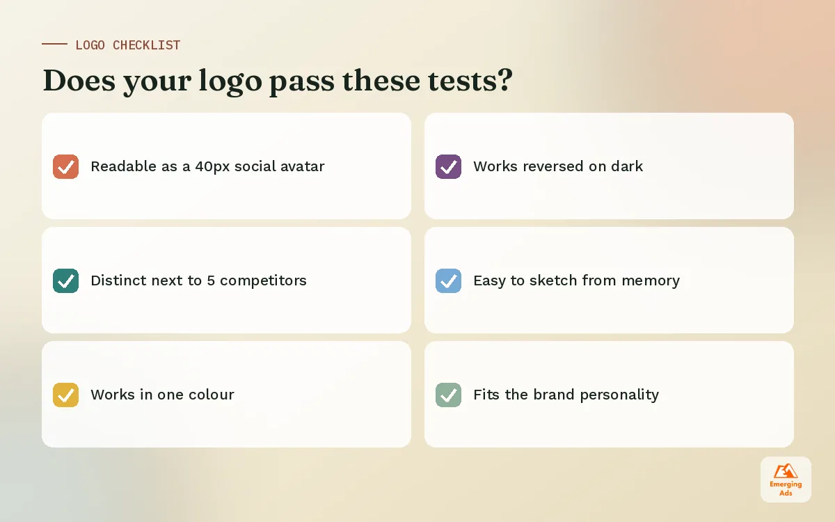
People judge logos by taste, which is why logo projects so often stall in endless feedback rounds. We try to replace taste with a short list of practical tests. A logo that passes them will serve the business well, even if it is not everyone’s personal favourite.
- Legible at small sizes. Most people will first see your logo as a 40 pixel social avatar or a favicon in a browser tab. If it turns into a smudge, it fails.
- Distinctive in its category. Put it next to your five closest competitors. If it blends in, it will not build memory.
- Simple enough to recall. Could a customer sketch a rough version from memory? The strongest marks usually can be.
- Flexible. It needs to work in one colour, reversed out of a dark background, stacked and horizontal.
- Appropriate. A law firm and a snack brand should not feel the same, even if both are “modern”.
Notice that none of these tests are about hidden meanings or clever symbolism. A clever idea is a bonus. It is not the goal.
02Types of logos and when each one fits
There are five common logo types. The right choice depends mostly on your name, your budget for building awareness and where the logo will appear most often.
| Logo type | What it is | Best for |
|---|---|---|
| Wordmark | The brand name set in custom or modified type | Short, distinctive names and new brands that need name recall |
| Lettermark | Initials or a single letter | Long names, professional services, compact app icons |
| Symbol or icon | A standalone mark with no text | Established brands with high awareness, or used alongside a wordmark |
| Combination mark | Symbol and wordmark together, usable apart | Most growing businesses, since it gives flexibility across placements |
| Emblem | Text inside a badge or crest | Heritage, food and drink, education, clubs |
For most clients we recommend a combination mark. The full version works on the website and packaging, while the symbol alone can carry social avatars and small ad placements. That flexibility matters a lot once you start running Meta ads and TikTok ads, where your logo often appears as a tiny circle next to the post.
03How to write a logo design brief
The brief decides the outcome more than the designer does. A weak brief gets you a logo that answers the wrong question beautifully. We build every logo brief from the brand strategy, which is why we usually complete a short brand strategy first.
What a useful brief includes
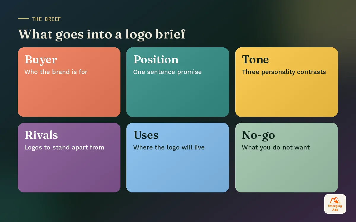
- Who the brand is for, described as a real buyer, not an age range.
- The positioning in one sentence, so the designer knows what the logo must signal.
- Three personality contrasts, for example “expert, not academic” or “warm, not cute”.
- Competitors to stand apart from, with their logos included.
- Where the logo will live: packaging, app icon, storefront sign, social, email, uniforms.
- Constraints: existing colours to keep, trademark concerns, languages or scripts.
- What you do not want. This is often more useful than what you do want.
04The logo design process step by step
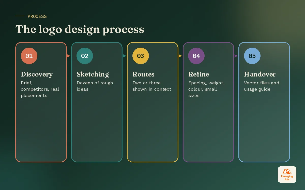
A professional logo design process has five stages. Rushing any of them usually means paying for a second logo within two years.
1. Discovery
The designer reads the brief, reviews competitors and asks questions. Good discovery also includes looking at how the brand will be used day to day, including the size of your ad placements and social profile images.
2. Sketching and exploration
Dozens of rough ideas, most of which you will never see. The point is quantity before quality, so the designer can find unexpected directions rather than settling on the first decent idea.
3. Two or three routes
You should see a small number of genuinely different directions, each shown in context: on a website header, a phone screen, a business card and an ad mock. Seeing a logo floating on a white page tells you very little.
4. Refinement
One route is chosen and refined. Spacing, weight, colour and small details get tuned. This is also where the logo gets tested in one colour, reversed, and at 16 pixels.
5. Handover
You receive the final files and a short usage guide. For larger projects, the logo becomes part of a full visual identity system with colours, type and imagery rules.
05Colour, type and shape: the decisions that matter
Much of what people call logo design is really three decisions: the letterforms, the shape and the colour. Each one carries meaning, and each one has practical consequences.
Typography
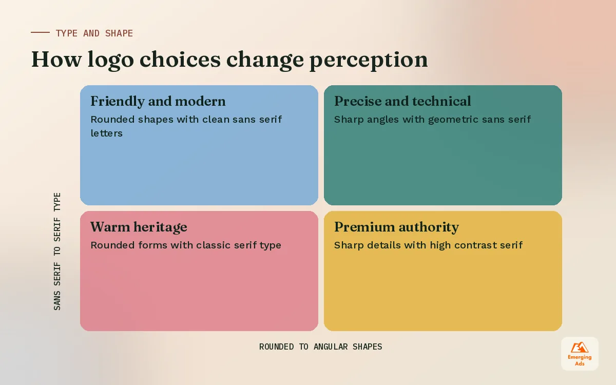
Serif typefaces tend to read as established, editorial or premium. Sans serif typefaces read as clean, modern and direct. Custom lettering is the strongest way to become distinctive, because nobody else can use the same letters. Whatever you choose, check the name for awkward letter pairs and make sure it reads clearly in small sizes.
Shape
Rounded shapes feel friendly and approachable. Sharp angles feel precise, technical or energetic. Circles and badges feel complete and protected. These are tendencies, not rules, but they are worth keeping in mind when a route feels off and nobody can say why.
Colour
Pick one primary colour you can own in your category, then a small supporting palette. Always design the logo in black first. If it only works in colour, it is relying on colour to cover a weak shape. We cover colour choices properly in the visual identity side of our work, and it connects directly to how your social media feed will look.
06The files you should receive after a logo project
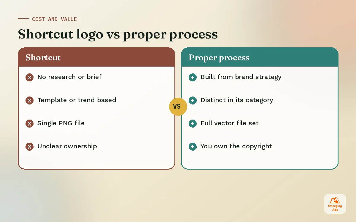
This is where many small businesses get caught out. They pay for a logo, receive a single PNG, and discover months later that the printer, the signage company and the web developer all need something else. Ask for this list in writing before you start.
| File | Format | Used for |
|---|---|---|
| Master logo, all versions | SVG and AI or EPS (vector) | Print, signage, scaling to any size |
| Web logo | SVG and PNG with transparency | Website header, email signatures |
| Social avatar | PNG, square, 1080 by 1080 | Instagram, LinkedIn, Facebook, TikTok profiles |
| Favicon and app icon | ICO or PNG at 32, 180 and 512 pixels | Browser tabs, home screen bookmarks |
| One colour and reversed | SVG and PNG | Dark backgrounds, embroidery, stamps |
| Usage guide | PDF, one to four pages | Clear space, minimum size, colours, what not to do |
Also confirm that you own the copyright once you pay. It sounds obvious, but a surprising number of contracts leave it unclear.
07Logo design costs and how to judge value
Logo prices range from almost nothing on marketplaces to large sums at established studios. The price difference mostly reflects research, thinking time and the number of real routes explored, not drawing skill alone.
- Marketplace or contest logos are cheap and fast, but often lack research and sometimes reuse templates. That creates trademark risk.
- Freelance designers vary widely. The best ones follow a proper process and can be excellent value for small businesses.
- Agencies cost more, but usually connect the logo to strategy, messaging and marketing use. That matters if you plan to advertise heavily.
The honest way to judge value is to ask what the logo needs to do. If it will sit on a small local shop sign, a simple process is fine. If it will appear in thousands of paid impressions a day, it deserves proper testing. We also design logos with tools our clients can use later, such as a Canva brand kit or a Figma design system, so the team does not need a designer for every social post.
08How to test logo options before you commit
Choosing between logo routes in a meeting room is guesswork. A few cheap tests give you much better information, and they take less than a week.
- The squint test. Shrink each option to favicon size and blur your eyes. The one that still reads as a shape usually wins in real use.
- The feed test. Mock each option as a social avatar next to real posts in your category. Which one would you notice while scrolling?
- The five-second test. Show each option to people in your audience for five seconds, then ask what kind of company it belongs to. Their words tell you whether it signals the right thing.
- The ad test. If you already run paid social, run the same ad with different profile images and compare click-through. It is not a perfect test, but it is real behaviour.
- The dark mode test. Many people browse with dark mode on. Check the logo on a black background, and in your website header and landing pages, before you sign off.
Collect the results in one place and look for agreement across tests. If one route wins on legibility and recognition, it is usually the right choice even if it was not the team’s first favourite.
09Logo design mistakes we see most often
- Too much detail. Fine lines and small text disappear at small sizes.
- Following a trend. Whatever style is everywhere this year will look dated in three.
- Designing by committee. Ten people giving feedback leads to a logo nobody hates and nobody remembers.
- Ignoring the name. Some names need a symbol because they are hard to read or pronounce. Others are strong enough to carry a wordmark alone.
- No real-world testing. Always check the logo on a phone, in an ad preview and on the actual website before signing off.
- Redesigning too often. Every change costs recognition. Evolve carefully rather than starting from zero.
If your logo already exists and something feels off, it may only need a refresh rather than a full redesign. Our main site explains when a rebrand is worth it, and the branding and content team can help you decide which route fits. For the bigger picture, see the wemergingads.com homepage or book a free audit of how your current brand shows up in your ads.
Frequently asked questions
Straight answers to what clients ask us most about logo design.
How long does it take to design a logo?
How much should a logo cost?
What makes a logo memorable?
Should my logo include my business name?
What file formats do I need for my logo?
Can I design my own logo?
What colours are best for a logo?
How many logo concepts should a designer show?
Do I need to trademark my logo?
When should I redesign my logo?
What is the difference between a logo and a brand identity?
Is your logo holding back your ads and your website?
Send us your current brand assets and we will show you how they perform in real ad placements, with a list of practical fixes before you spend on a redesign.
Book your free audit